


What's new
Twenty recent improvements in Evernote—plus a look at what’s next!
Product lead Federico Simionato overviews the team’s accomplishments in early 2024 and shares a preview of what’s coming in next.
Read more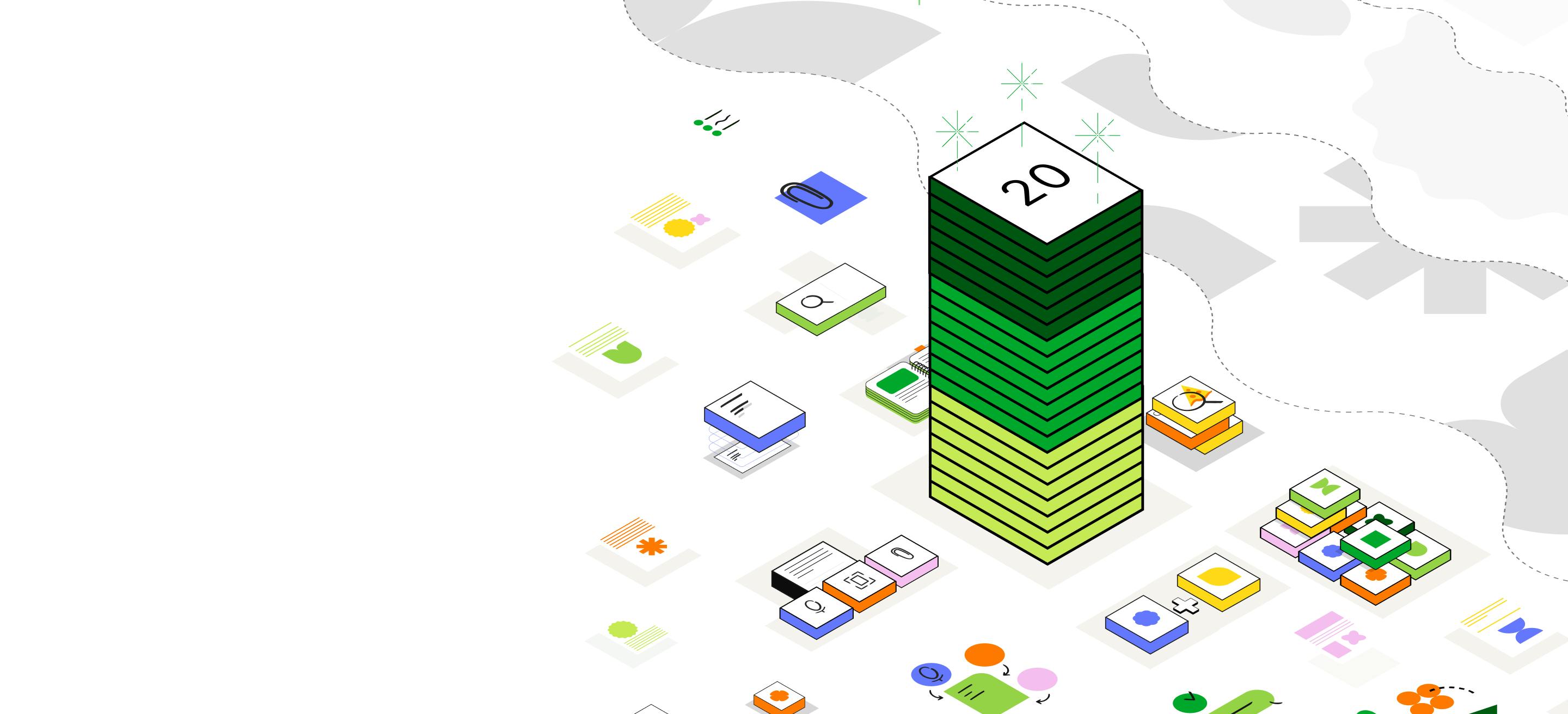
Remember everything and tackle any project with your notes,
tasks, and schedule all in one place.
![A UI rappresentation of [object Object]](/_next/image?url=%2F_next%2Fstatic%2Fmedia%2Fhome-widgets.b4be340b.webp&w=3840&q=75)

Keep important info handy—your notes sync automatically to all your devices.

Make notes more useful by adding text, images, audio, scans, PDFs, and documents.

Bring your notes, tasks, and schedules together to get things done more easily.

Get what you need, when you need it with powerful and flexible search capabilities.
Forbes

Product lead Federico Simionato overviews the team’s accomplishments in early 2024 and shares a preview of what’s coming in next.
Read moreUse Evernote to capture more than just words. Harness the power of the internet with Web Clipper. Scan and store your important files, documents, and images. Remind yourself how awesome you are with audio notes. No matter if it’s meeting notes, receipts, manuals, or family recipes, Evernote keeps them secure.

Evernote automatically syncs across all your devices so you can access your most important information anytime, anywhere. No WiFi? No problem—offline mode means you can continue to use Evernote even when the internet cuts out.

Intuitive Evernote search features like AI-Powered Search help you get the right information from your notes quickly and reliably. And our advanced search options aren’t limited to notes: with Evernote, you can search your PDFs, documents, and images with ease.

Evernote makes it easy to collaborate on projects. Real-Time Editing immediately syncs changes to keep all contributors up to date. The Tasks feature helps you outline the next steps and assign responsibilities. And with unlimited sharing permissions, everyone is the loop and on the same page.

With Evernote, you have everything you need to keep life organized. Use it for note taking, project planning, and to find what you need, when you need it.
Jot down your thoughts and inspiration anywhere, at any time, in any format, and on any device. Your important notes, images, receipts, and documents are safe and right at your fingertips.
Remember everything and tackle any project with your notes, tasks, and schedule all in one place.


